How Interactive Oceans Displays Large Datasets
Contents
How Interactive Oceans Displays Large Datasets
This notebook will walk you through our process in displaying some of the large datasets from OOI
import cmocean
from dask.utils import memory_repr
import matplotlib.pyplot as plt
import hvplot.xarray
from ooi_harvester.models import OOIDataset
Get Data
We will be requesting Axial Base Shallow Profiler CTD Data
desired_parameters = ['time', 'seawater_pressure', 'seawater_temperature']
ctd = OOIDataset("RS03AXPS-SF03A-2A-CTDPFA302-streamed-ctdpf_sbe43_sample")[desired_parameters]
ctd
<RS03AXPS-SF03A-2A-CTDPFA302-streamed-ctdpf_sbe43_sample: 59.9 GB>
Dimensions: (time)
Data variables:
seawater_pressure
seawater_temperature
time
This dataset has a total size of 52.2GB
start_dt, end_dt = "2020-01-01", "2021-01-01"
%%time
ctd_ds = ctd.sel(time=slice(start_dt, end_dt)).dataset
CPU times: user 13.7 s, sys: 6.25 s, total: 19.9 s
Wall time: 23.1 s
ctd_ds
<xarray.Dataset>
Dimensions: (time: 29403699)
Coordinates:
* time (time) datetime64[ns] 2020-01-01T00:00:00.235197952...
Data variables:
seawater_pressure (time) float64 dask.array<chunksize=(11102469,), meta=np.ndarray>
seawater_temperature (time) float64 dask.array<chunksize=(11102469,), meta=np.ndarray>There are about 29 million data points within that time range. This is huge for visualization!
We can check the size of 1 year of this dataset
print(f"This dataset size is {memory_repr(ctd_ds.nbytes)}")
This dataset size is 673.0 MB
Plotting
Now let’s try to create a depth plot (time, pressure, and temperature). We use hvPlot to perform the plotting. Using a plotting tool like matplotlib would take a really long time to plot.

Using matplotlib
fig, ax = plt.subplots()
ctd_ds.plot.scatter(x='time', y='seawater_pressure', hue='seawater_temperature', cmap=cmocean.cm.thermal)
ax.invert_yaxis()
ax.set_title('Axial Base Shallow Profiler CTD')
plt.tight_layout()
plt.savefig('ctd-profile.png', dpi=300, bbox_inches='tight', transparent=True)
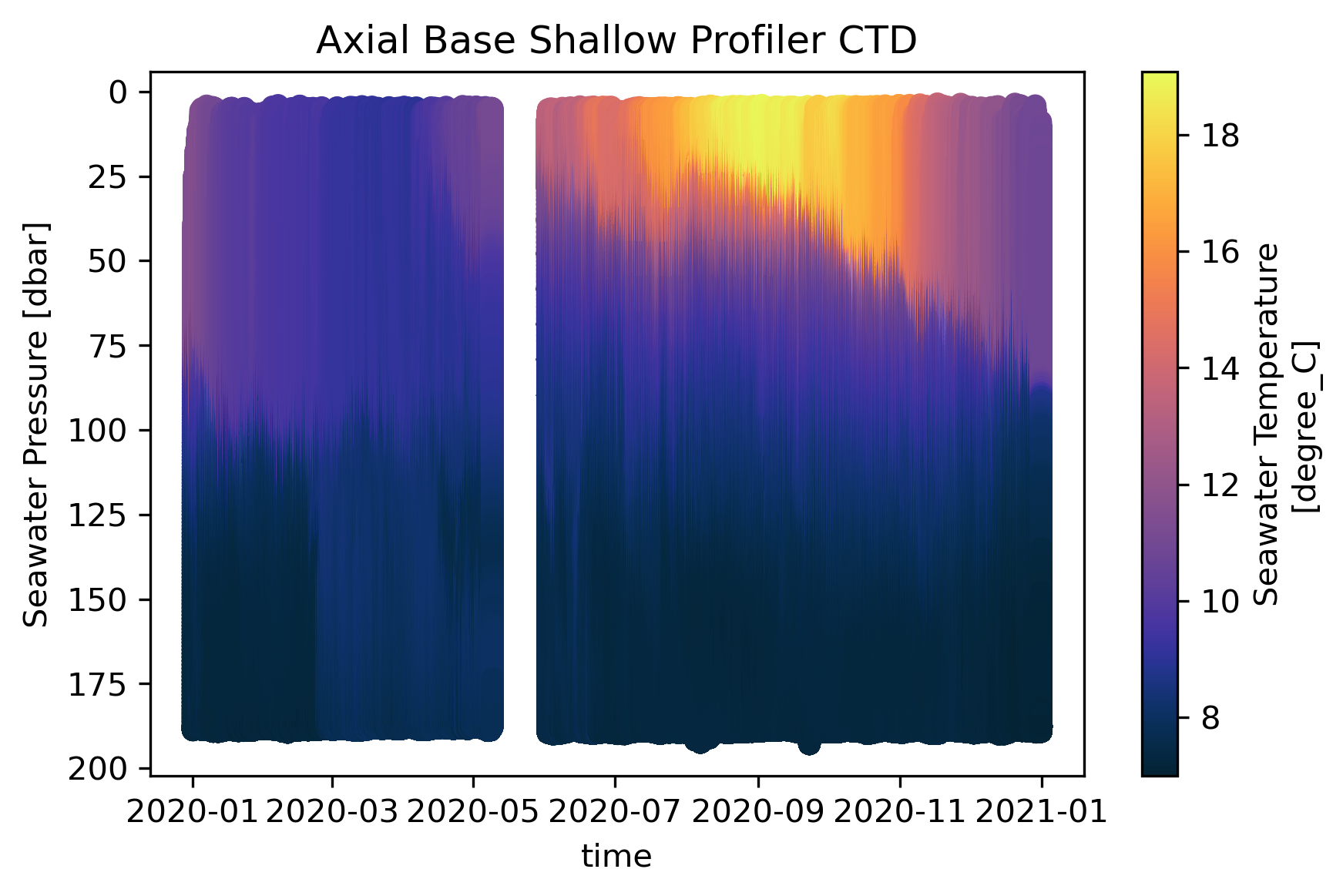
For purpose of comparison, the plot above was created with matplotlib pyplot using the builtin xarray plotting function.
Using hvPlot
plot_size = (888, 450)
%%time
plot = ctd_ds.hvplot.scatter(
x='time',
y='seawater_pressure',
color='seawater_temperature',
rasterize=True,
cmap=cmocean.cm.thermal,
width=plot_size[0],
height=plot_size[1],
).options(
invert_yaxis=True,
title='Axial Base Shallow Profiler CTD'
)
plot
CPU times: user 6.09 s, sys: 2.27 s, total: 8.36 s
Wall time: 12.8 s
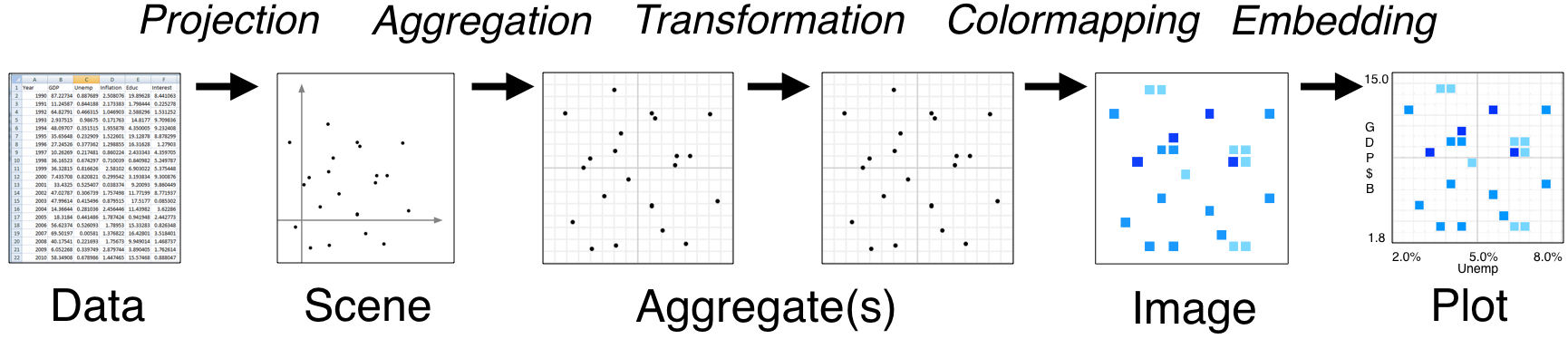
The hvPlot python library is part of the HoloViz Python Visualization Tools Ecosystem. Underneath, hvPlot utilizes HoloViews and Datashader in order to create the plot. We take the resulting data from the hvPlot plot and serialize that to JSON format for our frontend visualization engine plotly to render.
You can see that the resulting datashaded plot has exactly the same pattern seen in the matplotlib plot. For example, around 9/2020 there is a warmer water at the surface. This shows the accuracy of datashading.
Extracting underlying dataset
plot_data = plot[()].data
plot_data
<xarray.Dataset>
Dimensions: (time: 888,
seawater_pressure: 450)
Coordinates:
* time (time) datetime64[ns] 2020-0...
* seawater_pressure (seawater_pressure) float64 ...
Data variables:
time_seawater_pressure seawater_temperature (seawater_pressure, time) float64 ...The xarray dataset shown above is the resulting aggregated data from the datashading process that we push to the frontend application.
That’s all. That process happens with all of the datasets that we have, when the data request is large enough.